
Graphic Design Studio and Custom Letterpress Invitations
Recently we have been lucky enough to be featured on the wedding blog, Carats & Cake. Check out the full feature here!
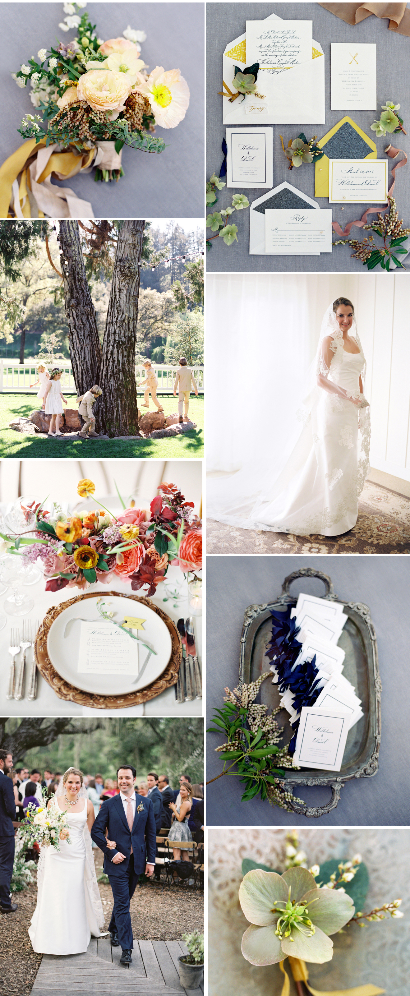
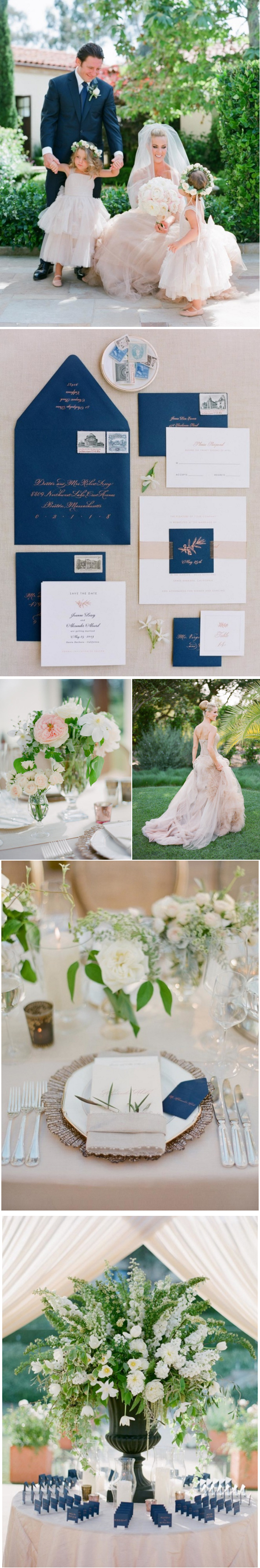
PRINTED ELEMENTS: A Day in May
EVENT PLANNER: Laurie Arons
PHOTOGRAPHY: Jose Villa
FLORAL DESIGN: Kathleen Deery Design
DRESS: Carolina Herrera
We are in love with these photos taken by Elizabeth Messina for Ashley Knowlton and Michael Shepard’s sensational wedding in Carmel, CA. Enjoy the pics here and follow the link to see more on Vogue’s website!
LINK TO FULL FEATURE ON VOGUE: http://www.vogue.com
PHOTOGRAPHY: Elizabeth Messina
CALLIGRAPHY: Tara Jones
We are honored to be party of Style Me Pretty’s Best Weddings of 2016! See below for an assortment of photos from the wedding and follow the weblink if you would like to see a list of ALL the best weddings:
Style Me Pretty Best of 2016
PHOTOGRAPHER: Jose Villa
EVENT PLANNER: Laurie Arons
INVITATIONS: A Day in May
FLORALS: Sarah Winward
For adorning the perfect gift, we love a combination of bold patterns and natural beauty. Happy wrapping everybody!

PHOTO CREDITS; SmartFurniture, Lauren Kelp, DIY Network, Panduro Hobby, Shopgirlmaria.blogspot, Paper Source, Onefabday.com
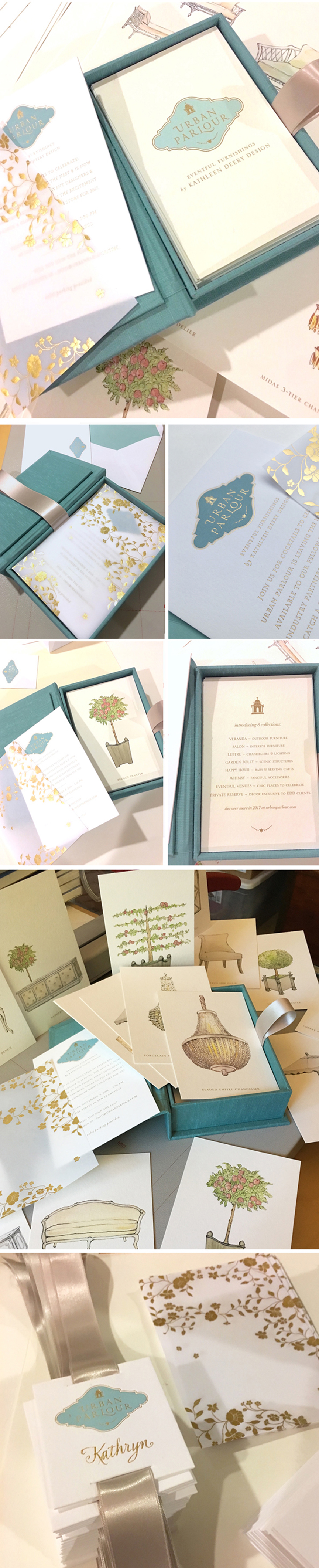
Check out the new logo we designed for the famed Kathleen Deery’s offshoot from her incredibly successful floral and event design business, Urban Parlour. You can now rent out her sensational furnishings, chandeliers, etc, to create a memorable event of your own. Below you will see our new logo along with the very cool invite we designed for her Urban Parlour launch. All lovely illustrations by Ya Wen Chien. Calligraphy by Michele Papineau.
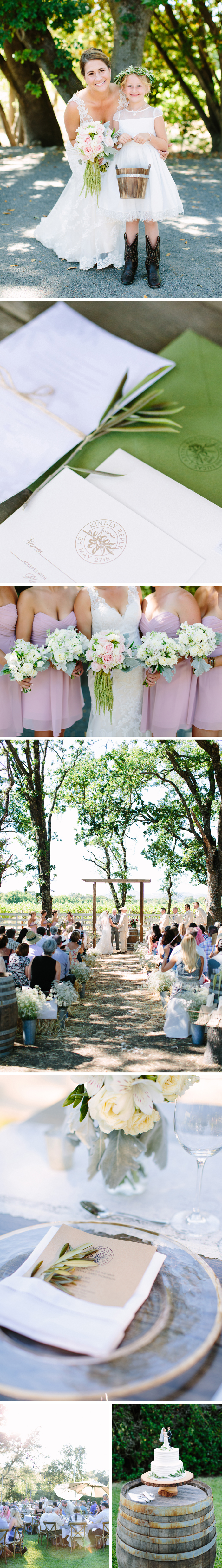 Photographs by MEGAN CLOUSE PHOTOGRAPHY
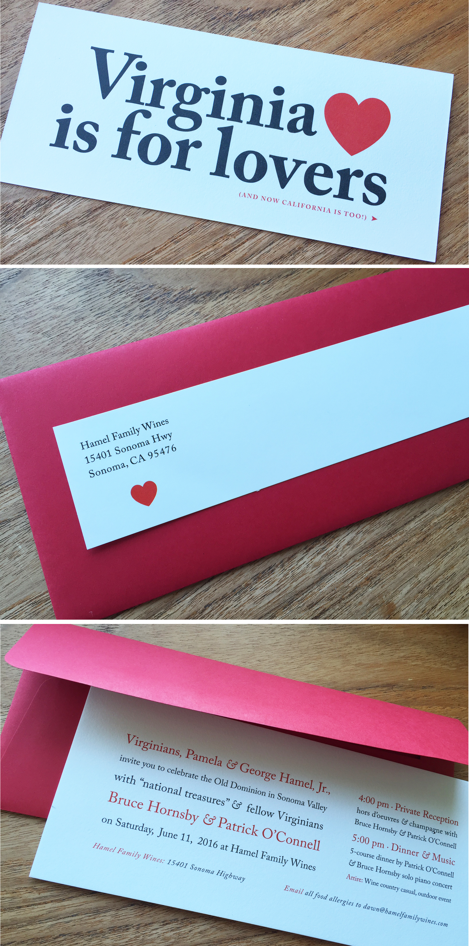
Check out this fun twist on Virginia’s famous bumper sticker. All in celebration of The Hamel Family Winery (The Hamels hail from Virginia, of course) event in Sonoma, California.
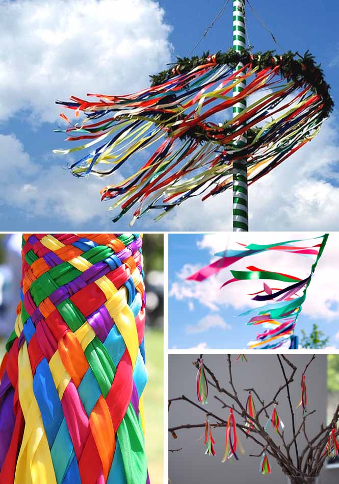
The May Pole’s colorful ribbons always bring up images for me of the bright and happy summer ahead!
Images from the following sources:
Check out this recent wedding at The Royal Hawaiian fit for a king and queen.
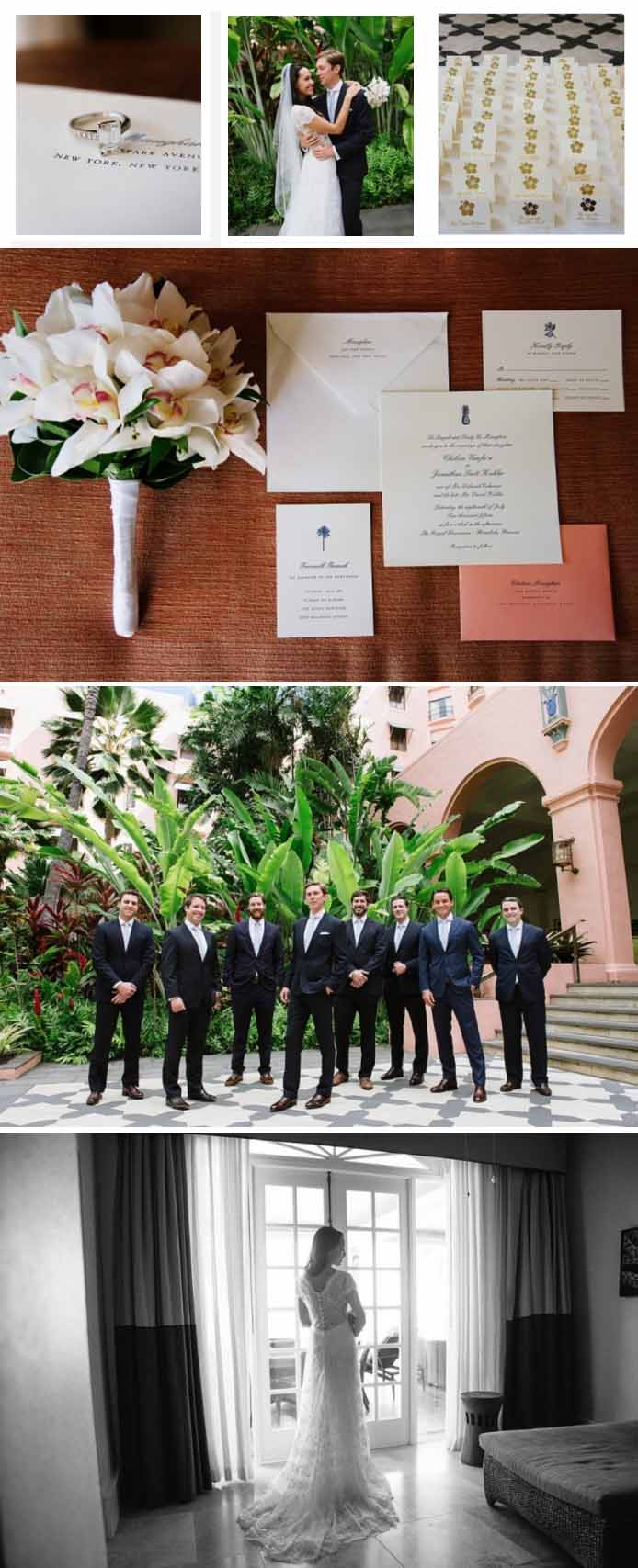
For more images and vendor info:
http://caratsandcake.com/scottandchelsea
Check out these wonderful photographs from Lesley’s very talented godson, Graham Ornstein. We are so proud! He’s a true artist in the making.
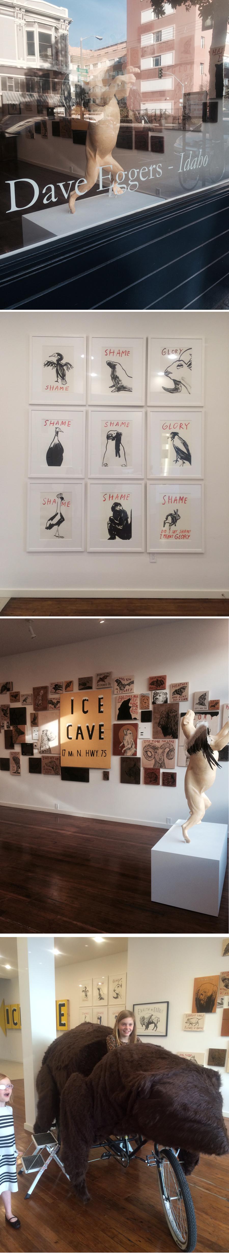
Eve’s friend Dave Eggers is best known for his writing but what many people do not know is that he received a degree in art and is also a graphic designer. He currently has a show at http://julesmaeghtgallery.com and 100% of the proceeds from his show go to Scholar Match.
We are happy to announce that one of our weddings has been selected as “Best of 2015” by Style Me Pretty. Check out this gorgeous Santa Barbara event photographed by the incredible Jose Villa!
http://www.stylemepretty.com/collection/3931/picture/2577861/
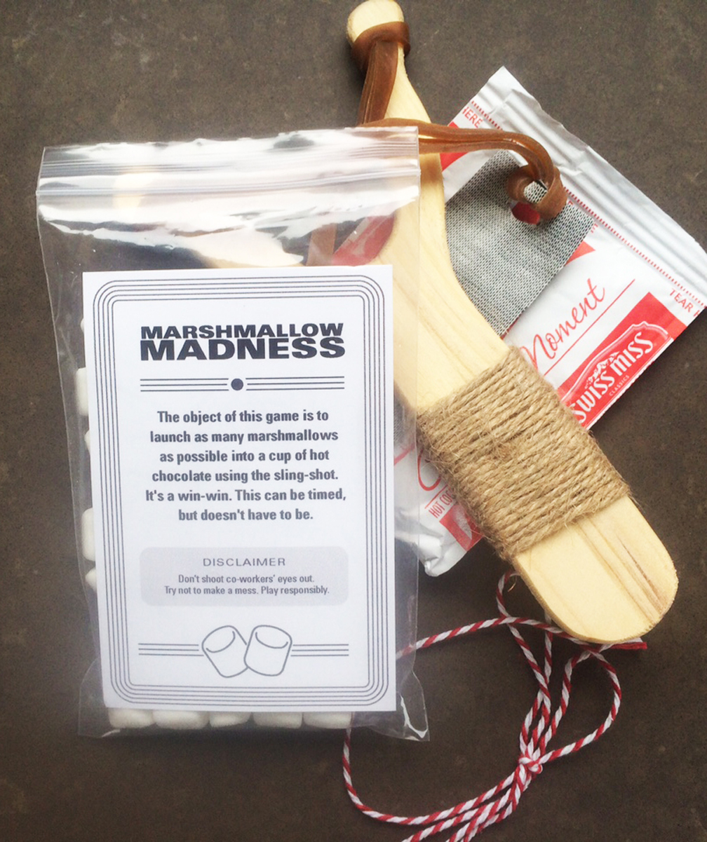
We love this holiday gift from one of our clients, the terrific AR design. Check out these sling shot marshmallow launchers intended to go direct into a steaming cup of hot chocolate. Love it.
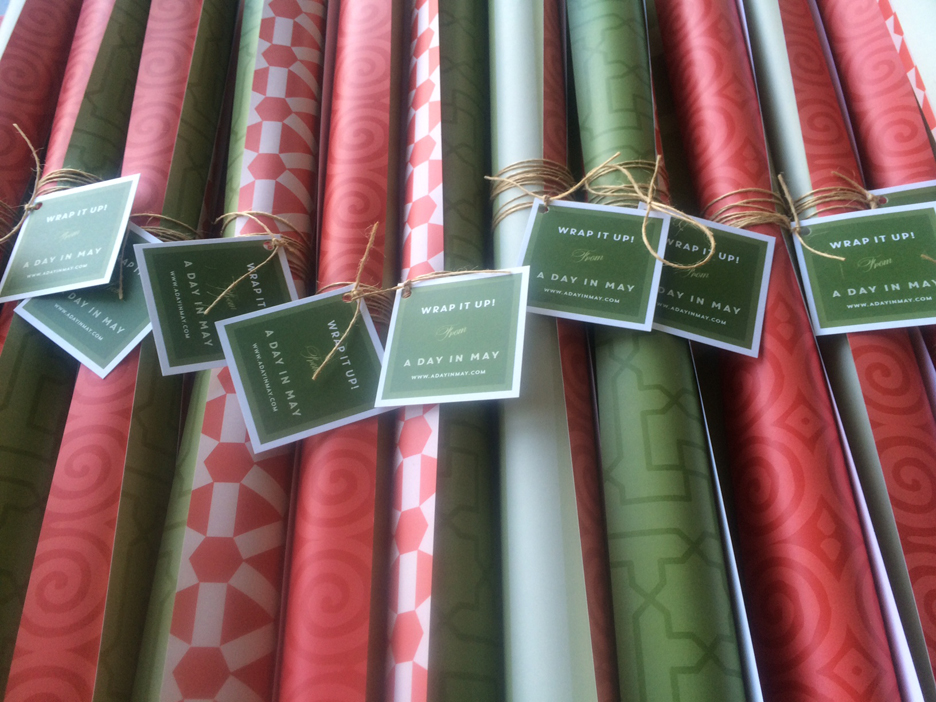
Check out our custom designed gift wrap we created this year!
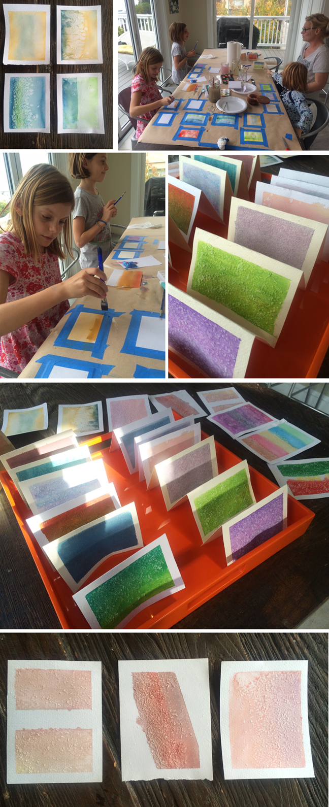
I loved this “gratitude” post on Meri Cherry.
http://www.mericherry.com/2014/11/24/gratitude-boxes-handmade-gifts-kids/
If you’ve never been to this site, take a moment to poke around a bit. It’s full of absolutely terrific crafts to do with your kids. For this craft, it was almost impossible not to create something lovely. We ended up with such a gorgeous collection of little cards – our big dilemma now is whether to frame them or pair them with pretty envelopes and give them as gifts!

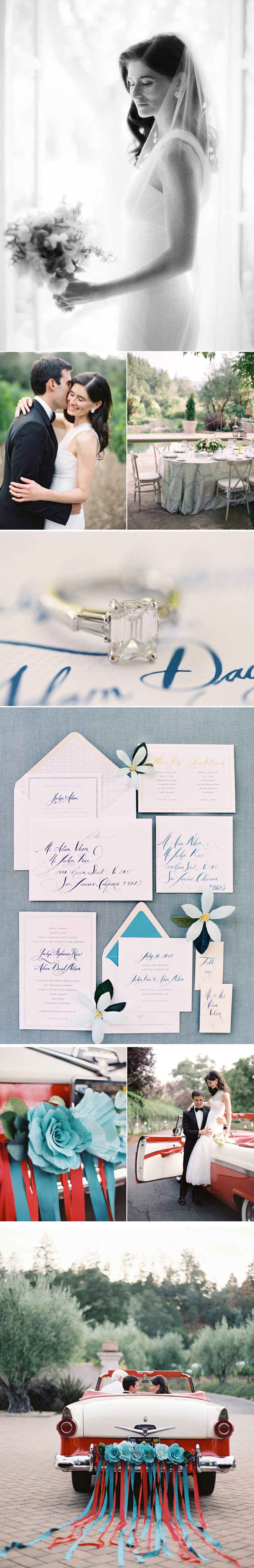
Check out this sensational wedding in Napa Valley photographed by José Villa and recently seen on Style Me Pretty. We just love the combination of aqua and red. So festive.
Printed Pieces: A Day in May Design
Calligraphy: Tara Jones Calligraphy
Event Planner: Laurie Arons Special Events
Photographer: Jose Villa
Paper Flowers & Getaway Car: Lynn Dolan
Catering: Paula Le Duc
Floral Design: Valley Flora
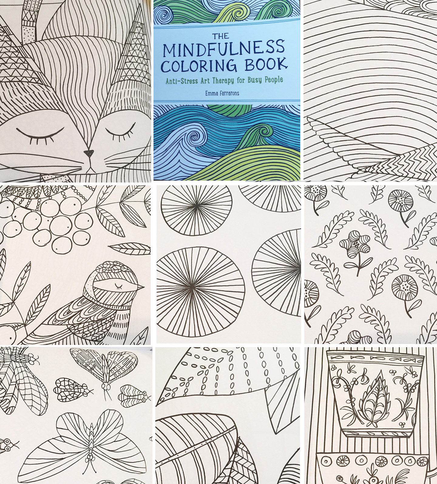
Is it just us, or have coloring books gotten much cooler lately? Check this one out, THE MINDFULNESS COLORING BOOK. It’s designed to reduce stress for busy adults. Who knew?
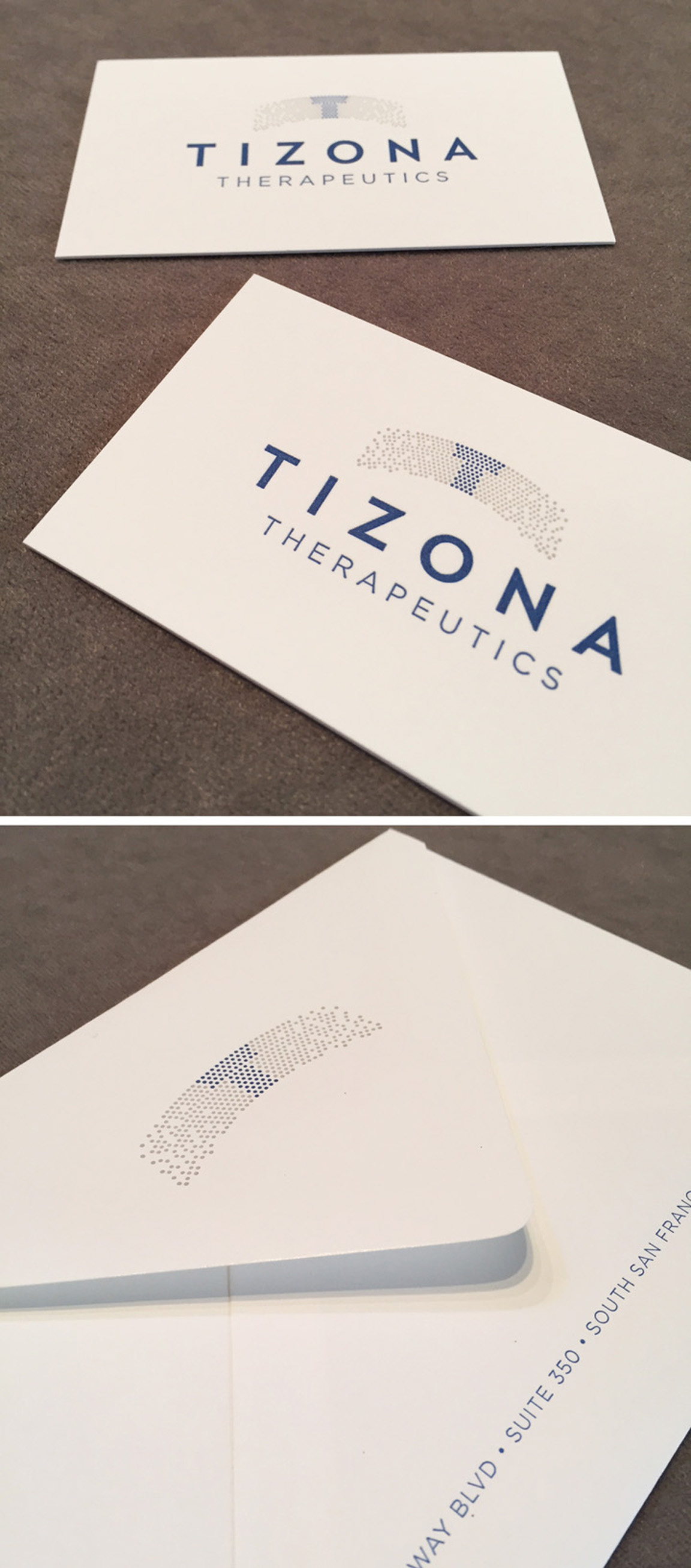
Take a look at our recently completed IDENTITY SYSTEM for the biotech company, Tizona Therapeutics.
Gretchen and Spencer were planning a beautifully classic wedding day in San Francisco, complete with a trolley ride for their guests and a ceremony in the iconic and stunning Grace Cathedral. We designed a graceful and whimsical monogram for the centerpiece of their invitation and added in an iconic trolley illustration for their transportation card. The color combination of a bold purple and a rich, dark gray helped strike just the right balance between the traditional, the iconic, and the fun.
Event Planner: Stacy McCain
Photography: Gertrude and Mabel
Ceremony: Grace Cathedral
Invitation Suite: A Day in May